


The challenge: To compete with better-known brands (at retail and to institutions) by communicating the brand’s three distinct traits: its steadfast commitment to sustainability, the strength of their product, and their local Texas flavor.
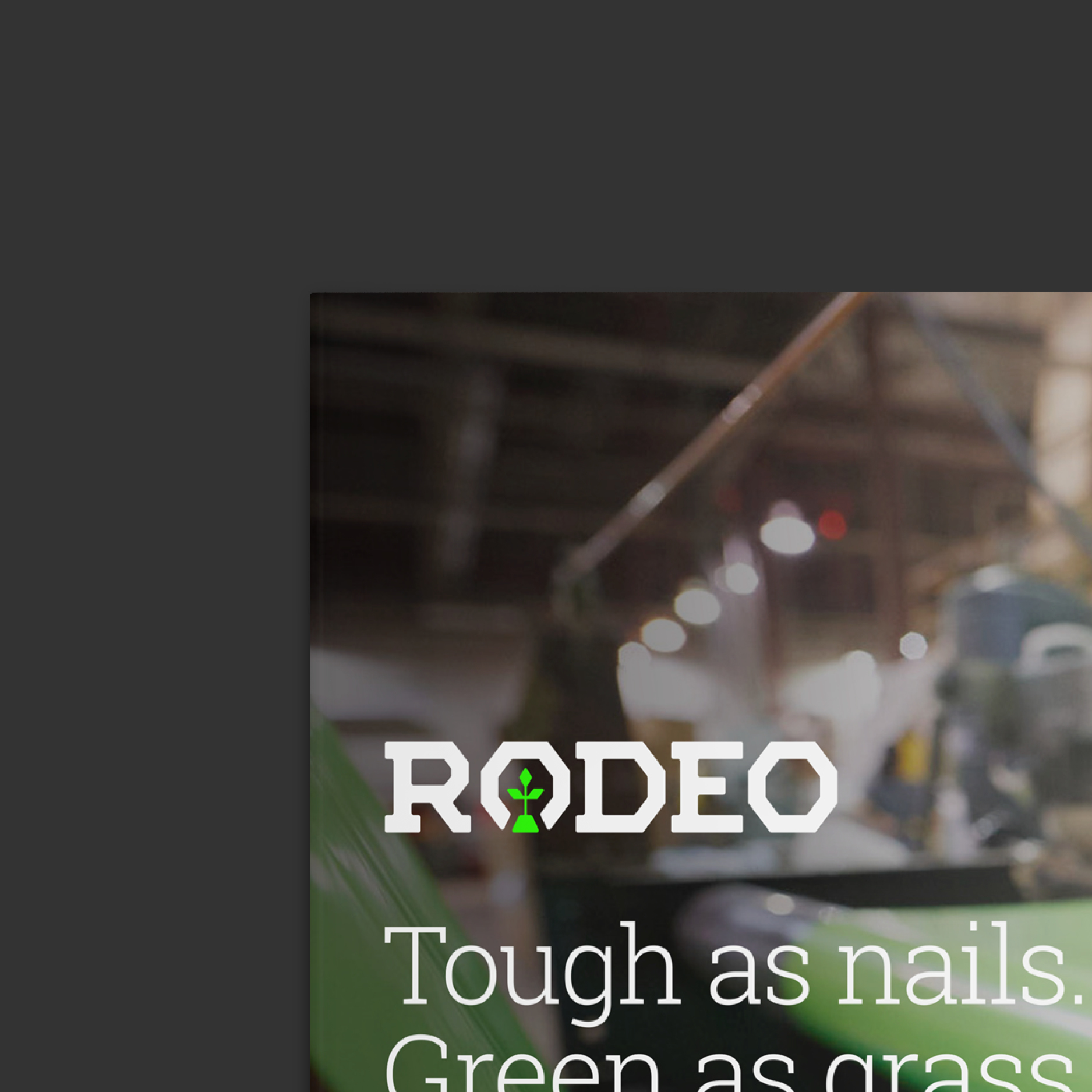
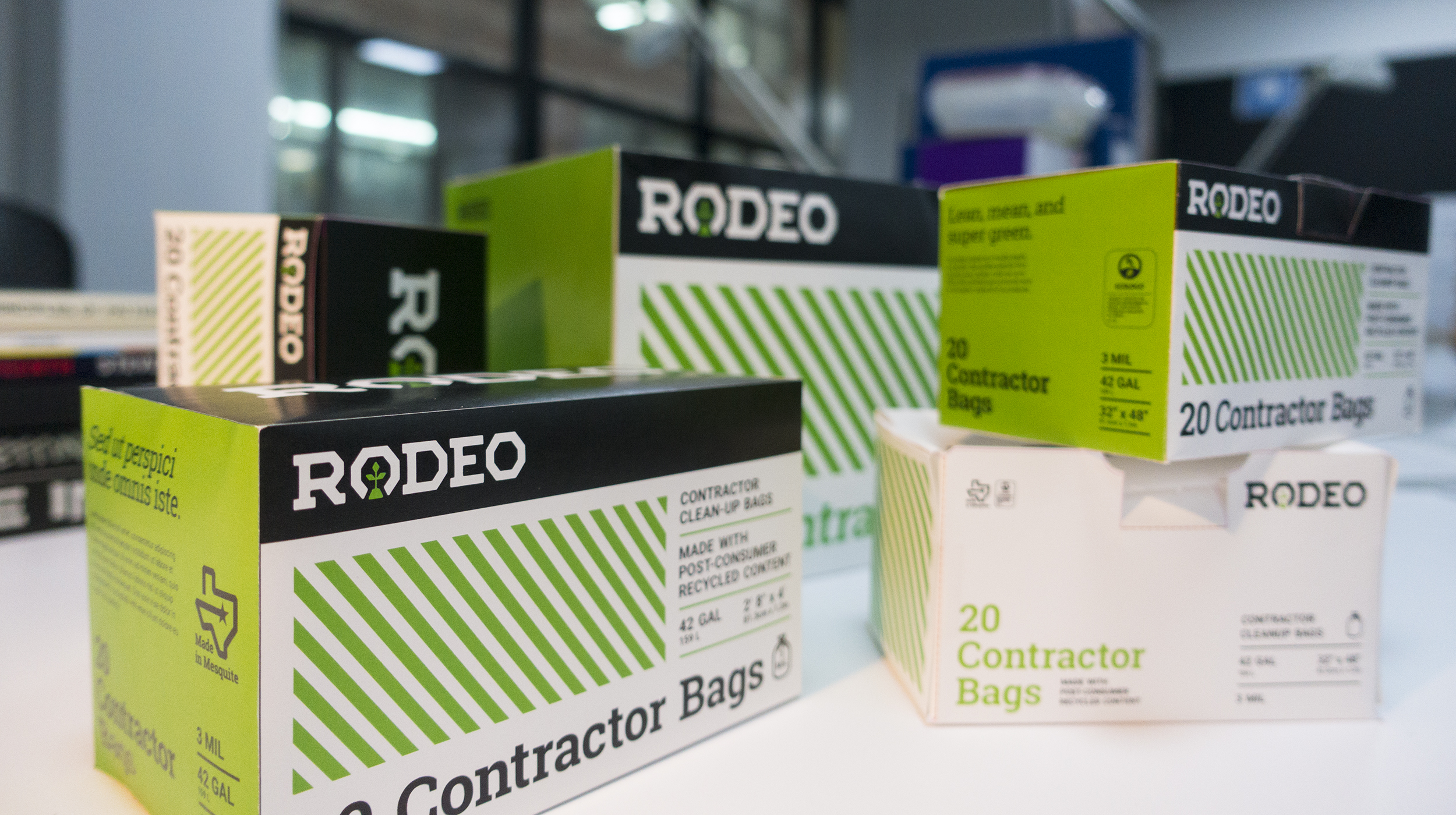
The solve: Go bold or go home. The palette breaks down to black, white, and neon green—nodding to its environmentally-conscious competitors, but edgy and striking in contrast. The logo's faceted forms emphasize strength, while the integrated plant symbolizes sustainability. As an inside joke to locals, the horseshoe shape around the plant honors the company's namesake (named after the famed Mesquite Rodeo). Paired with local vernacular, the new identity presents a look and feel truly distinct to Rodeo. Design included: branding, retail packaging, and sales collateral. Direction included: website, institutional packaging, and trade show environments. Created at Thinkso.